
Mobile Friendly Responsive Website Re-Design
Many of the new sites I’ve built recently have been responsive, mobile friendly sites – that is sites that respond to the size of screen they are being viewed upon and change accordingly. Not only does the overall layout scale to fit the screen but images scale, various elements get moved to accommodate the smaller screens of phone and tablets and menus and such like are often altered to make it easier to interact with them on touch screens.
‘Back in the day’ we used to build separate mobile websites (and even WAP sites) in addition to the main desktop website. I was never really an advocate of this, thinking (rightly so) that the technology would soon catch up and we’d be able to view full websites on mobile devices. That is now the case and I for one tend to want the full desktop version of a website even when I’m presented with a mobile version on my phone. Modern, responsive design is better than this though and is all about making a site usable no matter what device it is being used upon.
Google have got in on the act, stating that on April 21, 2015,
“Google’s mobile ranking factors will not only label your site as mobile-friendly, but will also use that to determine if your site should rank higher in the search results. Google said this algorithmic change will have a “significant impact” in the mobile search results, impacting all languages worldwide.”
This means that if your site isn’t deemed mobile friendly then it won’t rank anywhere near so well in search engine results pages on mobile devices. With that in mind I thought it was time to revamp a few of my sites to make them more responsive. It’s always my own sites that get the attention last!
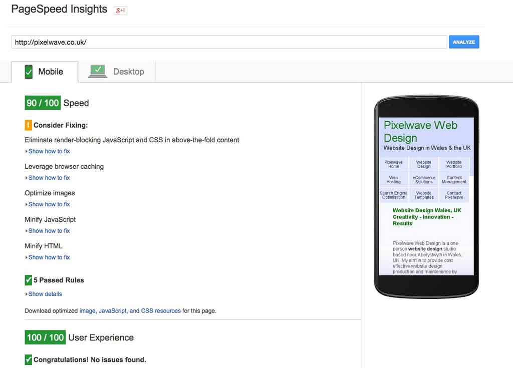
Google have a handy developer tool that allows you to check if your site is mobile friendly or not: PageSpeed Insights, provides you with a report on your web-page and some tips on how to fix any issues. I’ve recently made the Pixelwave Web Design site into a responsive design so that sidebars get out of the way as the screen size decreases, font sizes are larger than they used to be to aid legibility on smaller screens and some images are removed from certain sized screens. Images also scale to fit the viewport and tap targets are changed so as to be easier to use on a touch screen rather than with a mouse and pointer.
I’m pleased to say that the site now scores highly on Google PageSpeed Insights test and should therefore continue to rank highly in search engine results pages, even on mobile devices. It scores 90/100 for speed and 100/100 for user experience.
Responsive Website Design
I’ve also done a complete website re-design of my personal weblog, not only making it responsive in nature, but also changing the entire feel to a more modern upbeat kind of design with more emphasis on the photos and encouraging people to click through to read individual blog posts and hopefully comment more on them too. Here are the before and after shots.
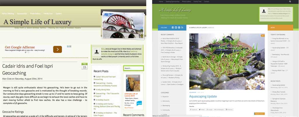
Website Re-design Before and After
